11 Visualizing Data
Why Visualize Data
“A picture is worth a thousand words,” and in a world in which journal articles have word count limits, figures and graphs are priceless. They are also an incredibly powerful way to examine your data because it can often illuminate patterns you may not be able to see through a table. Critically, descriptive statistics (means, standard deviations, and even correlation coefficients) can be deceptive!
As an example, let’s take a look at some summary statistics for four different datasets, each with an X variable and a Y variable:
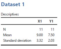
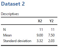
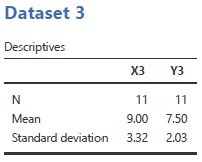
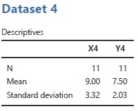
Hopefully you notice that all four datasets have the same means and standard deviations for the X variable and the Y variable. And, no, that’s not an error!
Let’s take a look at a visualization (aka graph). Specifically, below, you will see a scatterplot for X and Y for each dataset. The straight line on each plot represents the line of best fit (the regression line – more on that in a later chapter).
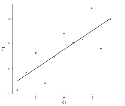
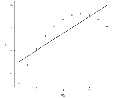
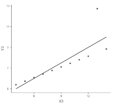
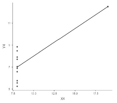
Now you can see how vastly different these datasets truly are. In addition, you might be surprised to learn that for all of these datasets, the Pearson’s correlation coefficient r = .82! (You might have some ideas about why this might not be a meaningful statistic in three out of the four cases, but we shall come back to that when we look at correlation coefficients in a later chapter.) So, the moral of the story is: visualize your data!
How to Visualize Data
jamovi has some plots built into its platform, both under the Plots drop-down menu in the Descriptives analysis and as options for many of the inferential statistical analyses.
We’ll learn more about how to choose and conduct better data visualizations later, but for now here are some recommended visualizations depending on what you are trying to do.
When you want to visualize the distribution of a continuous variable
First, there are two Histogram options: Histogram and Density. These are useful for seeing the overall distribution of your data and to help check for normality. Which should you use? I think they’re both pretty great, and in fact you can combine the two to have a histogram plot with a density overlay. I like this option best. If we go back to our Big5 data from the previous chapter, select the Analyses tab and then the Exploration button, and Descriptives, we can produce the following by selecting both Histogram and Density after selecting the variable Neuroticism:
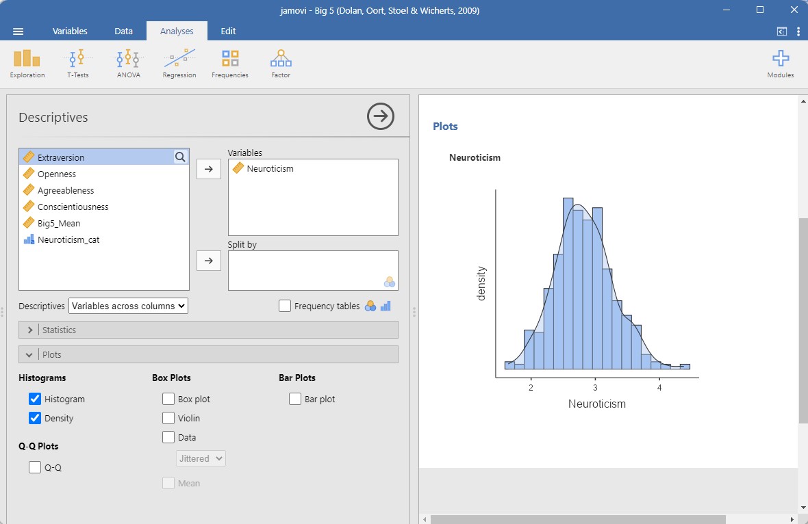
At a glance, you can see that the Neuroticism variable is approximately normally distributed!
Other options in jamovi include the boxplot. It indicates the median, interquartile range, and range of the data. Try it for yourself using the Neuroticism variable in the Big5 dataset. You’ll see a thick line in the middle, representing the median; the box itself spans from the 25th percentile to the 75th percentile; and the “whiskers” go out to the most extreme data point that does not exceed 1.5 times the interquartile range. Any observation whose value falls outside this range is plotted as a circle/dot and is commonly referred to as an outlier. How many outliers are there for the Neuroticism variable? (To be able to see this clearly, I recommend also checking the Data box, below the Box plot option, because this will show you each datapoint separately on the graph.)[1]
When you want to visualize the distribution of a continuous variable split by a categorical variable
There are three options under Box Plots: Box plot, Violin (which is really a density plot with its mirror image!), Data (which can be Jittered or Stacked; I prefer Jittered so you can see the density of data points really well), and Mean. Personally, I love checking all four boxes! This gives you the best of all them: the distribution of your data with the Violin option, the quartiles and mean with the Box plot option, a visualization of all your data points using the Data option, which is really useful because the other two options can be hiding weird things in your data, and what the Mean is.
When you want to visualize the frequencies of a categorical variable
For this you would choose the single option under Bar Plots: Bar plot. It will simply show the frequencies of a categorical variable.
Once you’ve drawn all these pretty graphs, you might be wondering how you can get them out of jamovi to show your friends or create a new fabric for a dress. Well, you can do that quite easily: right click on the plot image, select Image, and then Export, and you can export it as a PDF, SVG, PNG, or EPS. You can also select All and export all your analyses as a PDF.
- There are four outliers! ↵
