41 In Practice: Regression
Let’s run an example with data from lsj-data. Open data from your Data Library in “lsj-data.” Select and open parenthood. This dataset includes the sleep quality of both Dan and Dan’s baby, Dan’s grumpiness, and the day of the data collection from 1-100.
We’ll be testing how Dan’s quality of sleep predicts Dan’s grumpiness (later in this chapter we shall also look at how to add a second predictor).
1. Look at the Data
Our data set-up for regression depends on the type of regression and type of data, but in general we’ll have one column of our continuous DV and one or more columns of our IV(s). Once we confirm our data are entered and set up correctly in jamovi, we should look at our data using descriptive statistics and graphs, for dan.sleep and dan.grump. The table for the descriptive statistics shows that we have 100 cases and no missing data. The means, medians, standard deviations, and variances are then shown, followed by the minimum and maximum values.
2. Check Assumptions
There are several assumptions for regression and some of them differ a little from some of the assumptions we have encountered up until now. Let’s briefly describe each assumption and then we shall look at how to test them in jamovi.
- The DV is continuous and the IVs are either continuous, categorical, or ordinal.
- The relation between the variables is linear.
- Independence of residuals: the residuals are independent – uncorrelated.
- Normality of residuals: the residuals are normally distributed.
- Homogeneity of the variance (homoscedasticity): at each level of the predictor variable, the variance of the residuals should be constant.
- No outliers with high leverage: the model is not strongly influenced by a small number of data points (that change the slope of the regression line).
We need to know how the data were collected to check assumption 1, but the rest of the assumptions can be checked in jamovi.
Linear Relationship Between Variables
As we did for correlation, we should check that the relation between X and Y is linear by plotting a scatterplot (either using the scatr add-on module or through the correlation analysis). We saw in the last chapter that the relationship between Dan’s sleep and Dan’s grumpiness is in fact linear, so let’s go on to the next assumption.
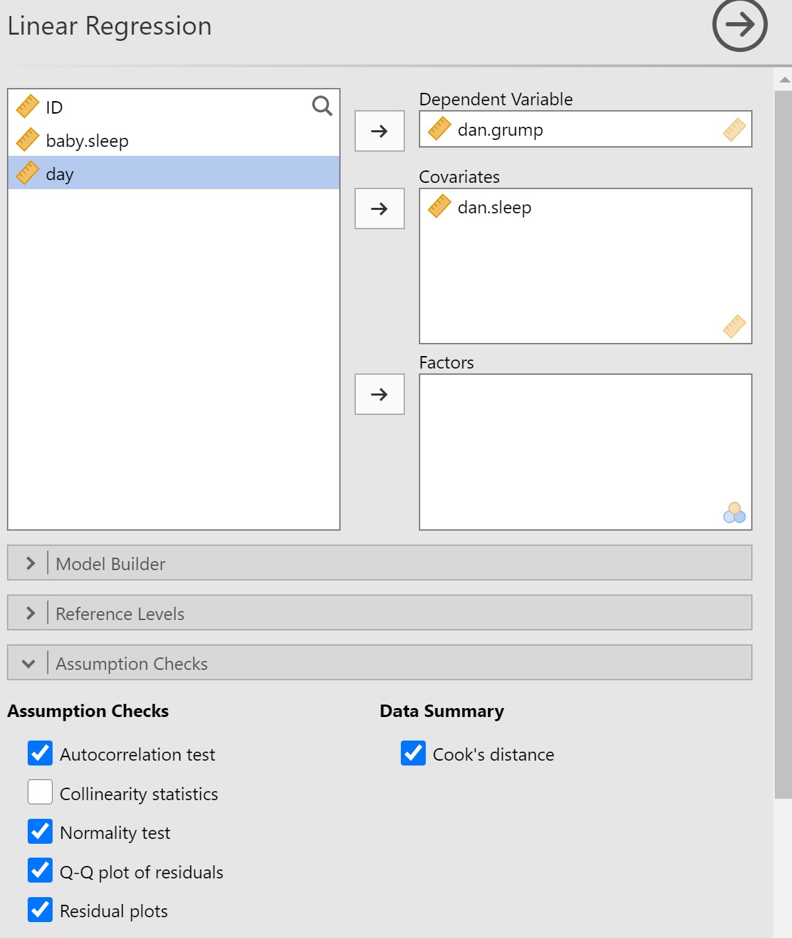
To test the next set of assumptions, you’ll need to go into the Regression analysis in jamovi. Select dan.grump as the Dependent Variable (of course it’s not really a dependent variable if we did not manipulate something, but that’s what jamovi calls the outcome variable). Select dan.sleep as the Covariate (the name jamovi gives to continuous predictor variables). Under Assumption Checks, select Autocorrelation test, Normality test, Q-Q plot of residuals, Residual plots, and Cook’s distance. Your set-up in jamovi should look like this:
Independence of Residuals
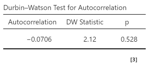
The Durbin-Watson test for autocorrelation tests for independence of residuals. We want the Durbin-Watson statistic to be as close to 2 as possible. Values less than 1 or greater than 3 are problematic and indicate we are violating this assumption. In our case, the DW test statistic is 2.12 and so very close to 2. Furthermore, jamovi provides a p-value and the p-value is greater than .05 so the test statistic is not statistically significant, further supporting that we meet the assumption that our residuals are independent.
If you violate this assumption, it’s likely a function of how your data were collected (e.g., you have nested data). We won’t be covering what to do in these cases, but if you have nested data you may be interested in multilevel or hierarchical modeling (MLM/HLM).
Normality of Residuals
“Artwork by @allison_horst” (CC BY 4.0)
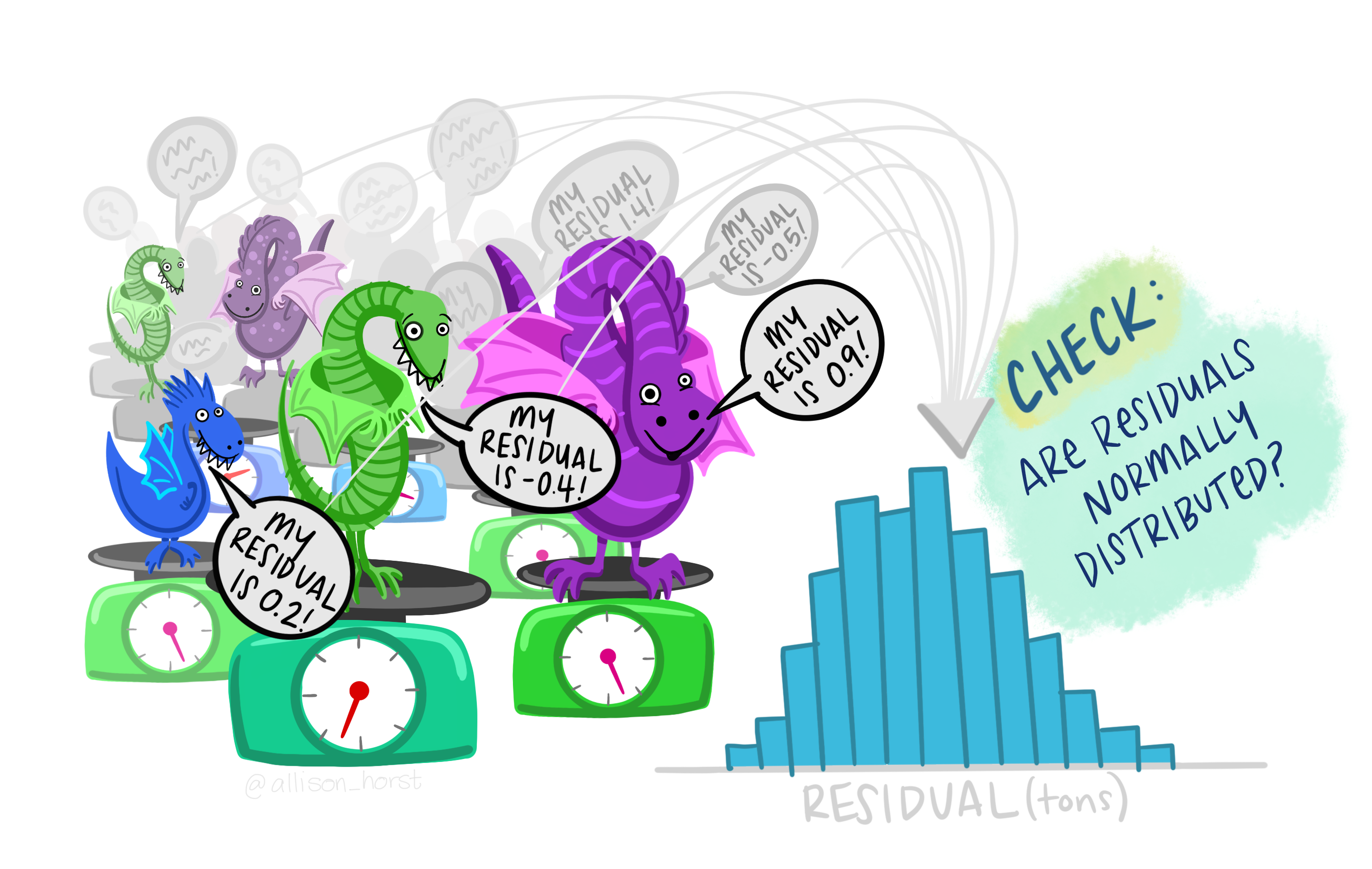 Together, the normality test and Q-Q plot of residuals allow us to assess whether the residuals are normality distributed. The Shapiro-Wilk test simply tests whether the distribution of the residuals is significantly different from a normal distribution. It has the usual caveats as we have discussed in other chapters (i.e., may not be meaningful with small or very large samples), so it is a good idea to use it in tandem with the Q-Q plot. The Q-Q plot for regression shows the standardized residuals (i.e., each residual is converted to a z-score) plotted as a function of their theoretical quantiles (what we would expect the residuals to be if they were normally distributed)[1].
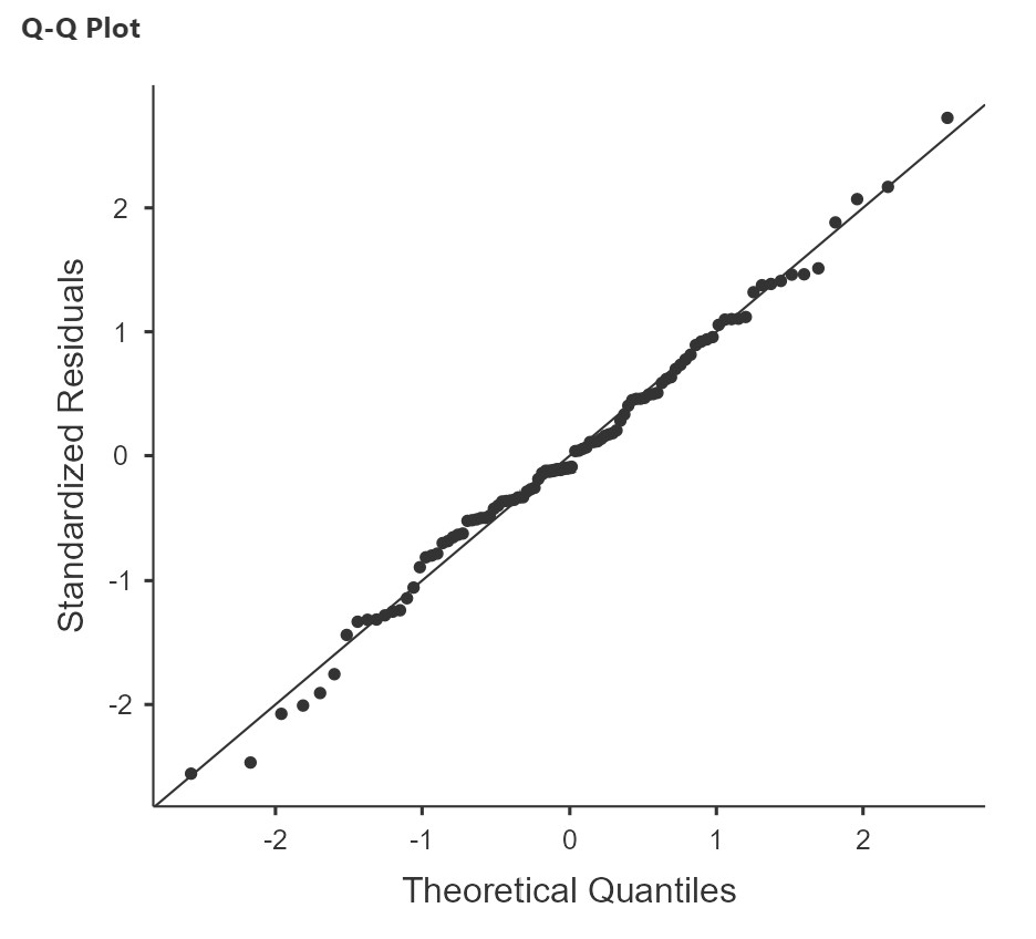
In our sleep-grumpiness example, the Shapiro-Wilk test is not significant and the Q-Q plot also looks like the dots fall pretty close to the straight line, so we can assume normality.
Homoscedasticity
To assess homoscedasticity, we examine the Residual Plots. You will get one plot of the overall model (Fitted) and one for each of your variables (DV and IV(s). We only focus on the Fitted residuals, shown below. In these plots, we want our data to look like a random scattering of dots even dispersed around zero on the y-axis. The plot below, from the sleep-grumpiness dataset, is a good example of homoscedasticity. The datapoints are randomly scattered around with no particular pattern to them.
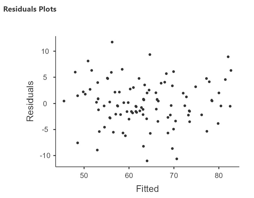
On the other hand, if we have a funnel or fan shape, a bow tie, or some other kind of pattern, then we have heteroscedasticity. (For examples of heteroscedasticity, see this here, approximately 3/4 of the way down the page you will see an example of homoscedasticity – random cloud, and two examples of heteroscedasticity – bow tie shape, fan shape.)
No Outliers with High Leverage
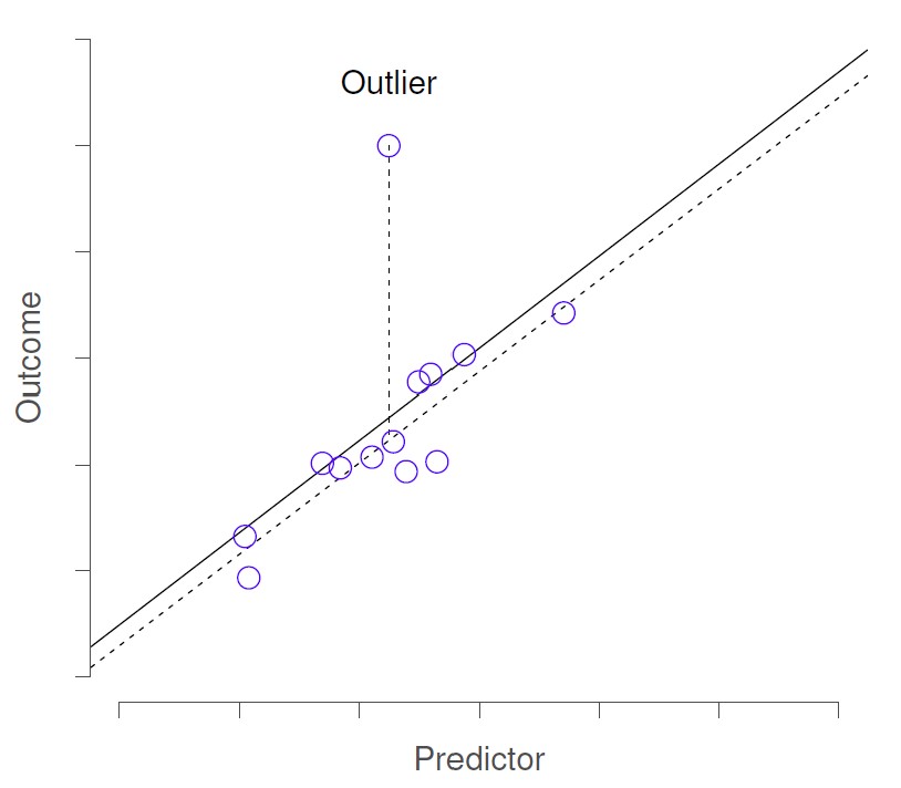
Outliers are just datapoints that are far from the rest of the dataset. Outliers with high leverage are those that additionally “pull” the regression line, and therefore result in a model/regression line, that does not actually accurately represent the majority of the data in the sample.
Below, the first image shows an outlier. If this outlier were removed from the dataset, the regression line (dashed line) would not change much from the original regression line (solid line). The intercept would be slightly lower, but the slope of the line would not change.
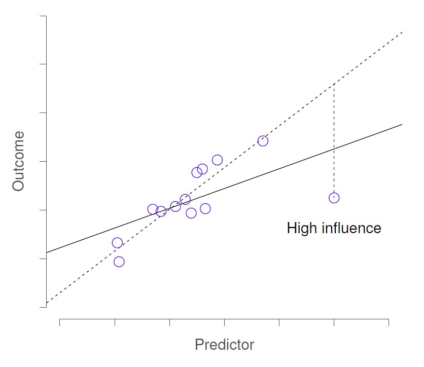
In this next figure, the outlier has high leverage and so is called a “high influence” datapoint. Removal of this datapoint would substantially change the slope of the regression line.
We can look at Cook’s distance to check for the presence of these “high influence” (outlier with high leverage) observations. If Cook’s distance is greater than 1, it is often considered large. The table below shows the summary statistics for Cook’s distance for our dataset. We can see the mean, median, standard deviation, and range for all the Cook’s distance values.
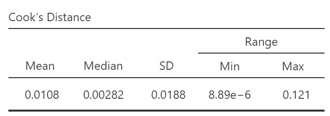
According to this summary, the maximum Cook’s distance score is 0.121. Therefore, we do not have any high influence observations.
What if we did? We can go to the Save options in our regression analysis and select Cook’s distance. This will add a new column in the dataset indicating the value for Cook’s distance for each row in the data. We can then try running the regression again with the observations with Cook’s distance value > 1 excluded (using a filter) to examine how that affects the regression coefficients. If it does have a substantial effect, then we need to dig further to understand why that observation is so different from the others (go back to your notes on data collection – was that a participant who was not paying attention or who appeared not to comprehend the instructions, for example?). Note that if we are going to exclude cases, we need to have a good reason for doing so.
3. Perform the Test
- From the ‘Analyses’ toolbar select ‘Regression’ – ‘Linear regression.’
- Move your outcome variable
dan.grumpinto the Dependent Variable box and your predictor variable into either Covariates (if it is a continuous variables) or Factors (if it is a categorical variables). In this case, all predictor is continuous so movedan.sleepto the Covariates box. - If you have categorical predictors with more than two levels, you will use the Reference Levels drop-down menu to specify what you want your reference level to be and whether you want the intercept to be the reference level or the grand man. More information on categorical predictors is beyond the scope of this class.
- Under Assumption Checks, check all the boxes (except Collinearity statistics – we’ll use that one later when we look at multiple regression)!
- Under Model Fit, select R, R-squared, Asjusted R-squared, and F test.
- Under Model Coefficients, select Standardized Estimate and the CI for the Standardized Estimate.
- Optionally, you can ask for plots and tables of the estimated marginal means.
4. Interpret Results
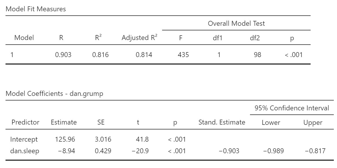
R, R-squared, and adjusted R-squared: We get our R and R-squared values (R-squared literally being R squared). Remember back to correlation: R-squared is the proportion of variance in the dependent variable that can be accounted for by the predictor(s). In this case, Dan sleep duration predicts 82% of the variance in Dan’s grumpiness.
However, more commonly we report the adjusted R-squared value, which adjusts the R-squared value based on the number of predictors in the model. Adding more predictors to the model will always cause R-squared to increase (or at least not decrease) so it’s important that we control for that using an adjustment. It’s interpreted basically the same, just adjusted for bias. I encourage you to use the adjusted R-squared, especially if you have lots of predictors in your model.
Overall Model Test: We also get an F-test for the overall model. If you want, you can get the full ANOVA test by selected ANOVA test under Model Coefficients. This is how we know if the overall model is statistically significant. In our case, our F-test is statistically significant so we know that the predictor significantly predicts our dependent variable.
Model coefficients: Just like in ANOVA, we first examine if the overall model is significant (overall model test) and then look at individual predictors. Each variable–our intercept and predictor (or predictors when we come to multiple regression, later)–have an Estimated value (the coefficient) and an associated t-test. The Estimate value for the intercept just tells us where the regression line crosses the Y-axis. The coefficient for dan.sleep tells us for each unit increase in dan.sleep, whow much does dan.grump change by. We can see that for each hour increase in Dan’s sleep, Dan’s grumpiness decreases by 8.94. In this case, the t-test also shows us that Dan’s sleep significantly predicts Dan’s grumpiness.
Standardized coefficients: We also asked for standardized estimates (Stand. Estimate), which we get in our model coefficients table. These are standardized so that we can compare them to other variables, which may have been measured on a different scale. They give us an idea of the strength of the relationship between that predictor and the outcome. Larger values = bigger effects. The standardized estimate is called the standardized regression coefficient or Beta (), whereas the unstandardized estimate is just called the regression coefficient or B (the letter B, not Beta). We use the standardized estimates to compare the strength of the coefficient to other predictors and we use unstandardized estimates to write our linear equations and predict the value of Y given values of the X.
What about the intercept? You might be wondering what we do with the intercept. Typically, nothing. We only use it to create our equation so that we can predict Dan’s grumpiness based on Dan’s sleep and the baby’s sleep. For example, our equation from our data isL
dan.grump = 125.96 -8.94(dan.sleep)
If Dan had five hours sleep, we would expect Dan’s grumpiness to be:
dan.grump = 125.96 -8.94(5) = 81.26
Note: we can only predict values of Y for values of X that are within the range of X values in our dataset. It is very risky to try to predict Y for values of X beyond the X values in our dataset because we do not know if the linear relationship continues for larger or smaller values of X.
Write up the results in APA style
For simple regression (i.e., with a single predictor) we can write the results in text format, as in the example below:
We explored how hours of sleep for Dan, over 100 days, predicted Dan’s daily grumpiness using simple linear regression. Dan’s hours of sleep significantly predicted Dan’s grumpiness, F(1, 98) = 435, p < .001, adjusted R2 = .81. For each extra hour of sleep Dan obtained, Dan’s grumpiness decreased by 8.94 points (SE = 0.43), .
Note 1: I did not report the t-test for the regression coefficient, B, because in the case of simple regression, this will be the same as the result of the F-test. For multiple regression, we should report the t-tests for the individual predictors.
Note 2: in many of these write-ups I did not include anything about assumption checking. I normally write up that information as part of my analytic plan in my methods section (e.g., “I checked for multivariate outliers using Cook’s distance.”). Included in this section, I explain what I will do if I do not meet various assumptions. Then, if I don’t meet the assumption in the results section I explain that I did not meet the assumption, explain the results if necessary, explain what I did, and then give the results. In this case, we met all the assumptions (that presumably I described in my methods section) and therefore went straight to the results.
- If you want to dig a bit deeper into Q-Q plots to understand better how they are created and see some examples of normal and non-normal plots, see https://towardsdatascience.com/q-q-plots-explained-5aa8495426c0. ↵
